5 Tips and Tricks to Design a Stunning Yearbook

Are you searching for design inspiration for your yearbook? Do you want to make a beautiful spread but are uncertain on how to begin? Check out 5 useful tips and tricks that can help you make your yearbook pages pop!
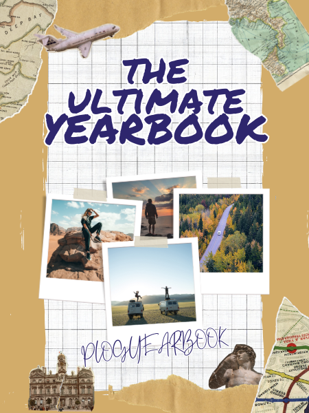
Make your cover stand out
Despite the popular saying, many people do in fact judge a book by its cover. It’s perfectly understandable, considering that the cover is responsible creating the book’s first impression for the reader. This makes it even more important for your cover design to be aesthetically pleasing, so that you can entice readers to flip open your yearbook! A few ways you can go about achieving this is to make sure that your yearbook cover isn’t too wordy. As for the design, it’s entirely up to you if you wish to take a minimalist or maximalist approach. Bold, strong graphics are bound to catch the eye of readers, while simple designs convey a sense of sophistication and elegance. It’s also best to sport a unique design, like your school logo, to make sure that people know it is a proud campus product!
Maintain a consistent design across pages
Consistency is key! If you want your yearbook to look professional, it is recommended that you ensure a sense of design coherency across its pages. Try to stick to the same theme, colour palette, font types and photograph filter (if any) throughout your yearbook, as too many variations can make your pages seem discordant from each other. You know you’ve done it right when your final page designs appear as a unified whole!
Consider material types
Aside from customising the content of your pages, you can also personalise the specifications of the physical book itself to ensure that your yearbook looks its best. You may want to consider your yearbook’s:
- Cover type (hardcover/softcover)
- Cover lamination
- Binding method
- Paper type
These choices can make a big difference to the presentation of your final product! For example, some people prefer the subtle, velvet surface of a matte cover, while others favour the bright, reflective surface of a gloss laminate.
You may want to do a little research before making your selection! Our webstore provides detailed explanations behind each customisation option and more.
Balance text and graphics
Words and illustrations often go hand in hand with each other. Too many words may put people off reading them, while too many illustrations may have your readers searching for their context. As such, it is important to strike a delicate balance between the two. With every photograph inserted, it is best to write a short caption describing the people or events it illustrates, and with every paragraph written, a photo or clip-art can serve as a good complement. Stories are told both ways in words and visual art—in a yearbook, one should not go without the other!
Collaborate
Yearbooks are a collaborative effort. It takes a team to collate and organise so many photos of so many different people, and decide on the final layout and design of the completed yearbook. As such, it is no individual effort, and perhaps that is the fun in putting it together! Try to bounce ideas off each other and take your team’s opinions into consideration—they may think of something you hadn’t. Divide tasks to make the yearbook consolidation more manageable. Try to get the inputs of everyone to further personalise your yearbook story.
Design and print your yearbook with p;log
At p;log, we believe in capturing life’s beautiful moments. Our wide range of quality and fully customisable yearbooks and other keepsakes aim to make your memories look their best, no matter how many years may pass you by. Visit our webstore or email us at hello@plogyearbook.com to get started. Enjoy bulk discounts and other attractive promotions when you choose us for all your custom printing needs.